New app offering enhanced user experience
New app offering enhanced user experience
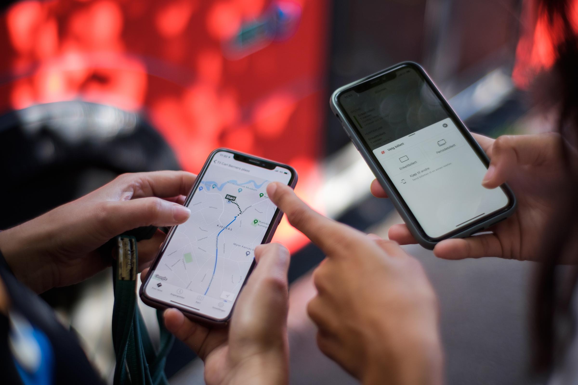
In 2021, we launched our new app – it is our most important interface with customers and a major step on the road to a unified user experience across all of Ruter’s digital channels.
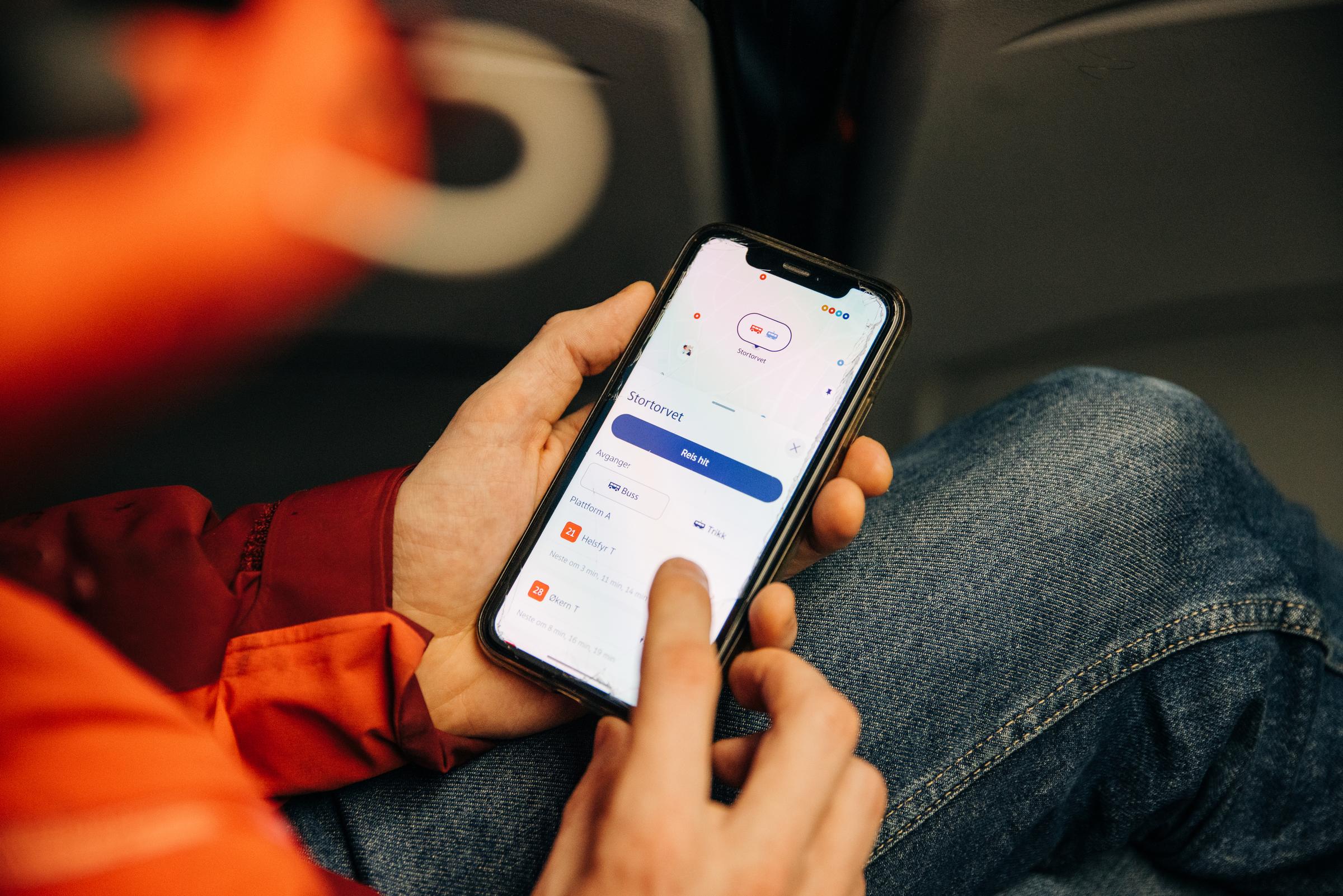
Not only have we gathered Ruter’s two main features – travel planner and ticket purchase – in one place. We have created new and long-awaited features such as maps and personal profile. Even more exciting is the way in which we offer new services to encourage people to walk and cycle more and offer other mobility services than the ones Ruter is perhaps currently best known for.
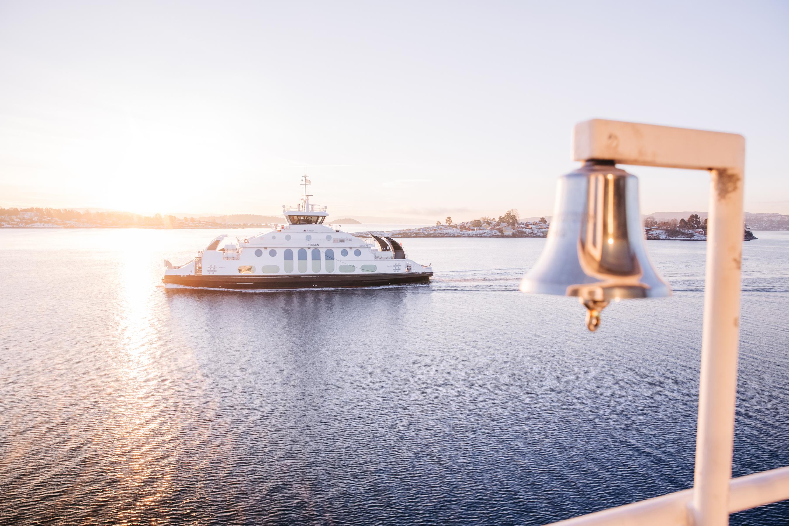
We live in an area with everything from museums, vintage shops and sausage stalls to fjords, fields and fishing lakes. An area with the 13 tram to Skøyen, Tier to Greenland and the 565 bus to Myklerud. Ruter has a mandate to make public transport – in combination with cycling and walking – a natural first choice. With the new Ruter service, we want to provide exactly what is needed for people to unlock Oslo and Viken. A service that promotes seamless mobility for everyone who lives here, moves here or visits.
In a time when designers and product developers all over the world are devising ways to increase the time people spend using their services, we dream of the opposite.
Customers should no longer have to look for the content they need. They should simply spend less time and effort on public transport. By offering an effective service, customised content and an intuitive solution, we make mobility in the metropolitan area easier.
A new visual universe
Customers have high expectations for digital products. They want a seamless experience, and we compete with major international brands and digital products in the transport sector. Our existing apps – RuterBillett and RuterReise – were popular, but the design was based on the operating systems they were built for.
We wanted to create an entirely new and personal service to make public transport appear a little more colourful and human. To achieve this, we needed a visual design language to allow us to make our content more personal and relevant. The solution? An extended colour palette and a distinctive font as well as brand-new animations, illustrations and icons. Combined with a clear, playful and personal language profile, our design choices make Ruter look intuitive, caring and lively.
video_player
We won the DOGA mark for design and architecture
In March 2021, in partnership with Bakken&Bæck and NoA Ignite, Ruter won the DOGA mark for design and architecture for the design work on the new Ruter app.
The jury’s statement
“Ruter is a clear-cut example of excellent design management where the finished product appears friendly and warm. Beneath the soft surface, however, lies professional coding that captures the entire complex Ruter offering in an intuitive and appealing user interface. We also let ourselves be charmed by the way in which the app ‘nudges’ the user to choose walking or cycling. We also applaud Ruter for thinking holistically about seamless mobility from the traveller’s perspective.
Ruter’s new travel service has been awarded the DOGA mark for design and architecture because it is a long-awaited service that has been excellently designed and applied down to the smallest detail.”
Onwards towards a more holistic user experience
The new visual universe shows that we offer the same service across interfaces. It was initially developed for the app but also had to be capable of extending to other digital interfaces such as network solutions and onboard screens as well as screens in bus shelters and on other dynamic signage.
Ruter’s design system is an important part of the expansion of its visual universe. It consists of tools, components, guidelines and processes that are continuously updated and improved across teams. Designers and developers are able to react quickly to create and test new features. For the customer, the result is a user experience that feels uniform across interfaces and services.
A personal travel experience
Ruter’s digital universe will help to ensure travellers in Oslo and parts of Viken a personal travel experience. The fact that customers are now able to create a personal profile in the Ruter app means that we are well on our way. An obvious advantage is that customers have access to their own data no matter where they log in. It also makes it easier for customer service to help those who have lost their ticket for whatever reason. In the long run, favourites, travel history and much more will follow the customer – all they have to do is log in. Customers seem to value this service. At the time of writing, two-thirds of weekly active users have set up a personal profile in the app.
After launch, we spent a great deal of time learning what customers like and dislike about the app. The new travel search feature was unfamiliar to many, and we received critical, but mainly constructive, feedback. We listened to customers and made a number of changes to the travel suggestions list: the ability to load more travel suggestions pull to refresh, redesign of cycling and walking options, filters for airport shuttle trains, enhanced display of delays and more accurate real-time information.
A smarter app
But the aim to personalise the customer experience involves more than that. We now also offer automatic travel suggestions based on time, location and customer favourites. A simple test yielded promising results: over a third of customers who viewed suggestions for the next departure to and from work also pressed to view departure times.
Route departure times are a top customer priority – all the data we have indicates that. Over a quarter of our customers check departure times on a line more than seven times a week. Many customers want to have the feature that was available in RuterReise – where they could manually select a specific line as their favourite – reinstated. But the road to a personal travel experience is largely based on customers’ own usage patterns. The app has to be smarter than manual customisation. It has to be able to create an invisible network of the customer’s favourite lines, stops and journeys. In this way, we train the app automatically to respond to a customer’s personal requirements every time the customer opens the app.
Three-quarters of our customers use the journey search feature more than seven times a week.
New platform, new products and services
We launched the app to include the most popular ticket types as well as a completely new way of buying a ticket: if customers are looking for a specific journey, they can now buy a ticket for this particular journey. Following the launch, we also added more services to ensure that the new app included all the features contained in both RuterReise and RuterBillett.
But the new app has also been designed in a way that allows us to offer entirely new services. These services can be purchased separately or combined with our traditional tickets. This means that customers can pay for scooters directly in the app or buy a monthly card that includes free use of city bikes and other mobility services.
This is possible because we have rolled out a new real-time platform for all data and services used in the Ruter app, but also elsewhere in Ruter. In simple terms, we have gone from a slow, monolithic system with many complicated dependencies to small services that can be easily updated and maintained. This allows for speed and the opportunity quickly to add further development, improvements and scaling. We have gone from a few updates a year to a continuous rollout of new functionalities.
Customers decide
We have also organised ourselves in a completely different way. All product teams in Ruter are autonomous – those who are closest to a problem and have the most information about it are given the responsibility and authority to solve it and drive further development in their particular area. What they all have in common is that they explore key issues based on real customer needs.
“The pandemic has given customers an increased need for flexible tickets, which has led us to explore, prototype and user-test new ticket concepts in collaboration with our customers.”
graph
How to buy a ticket in the app
The concepts that impact customer needs the most and create value for both customers and Ruter are developed and rolled out in the app. We then test our features on selected customer groups. New functionalities and products, therefore, become a natural part of everyday customer travel – which gives us the ability to analyse customer use in real-time.
This means that we obtain fast and useful data and are able to improve the customer experience before we introduce the concept to all customers using the app.
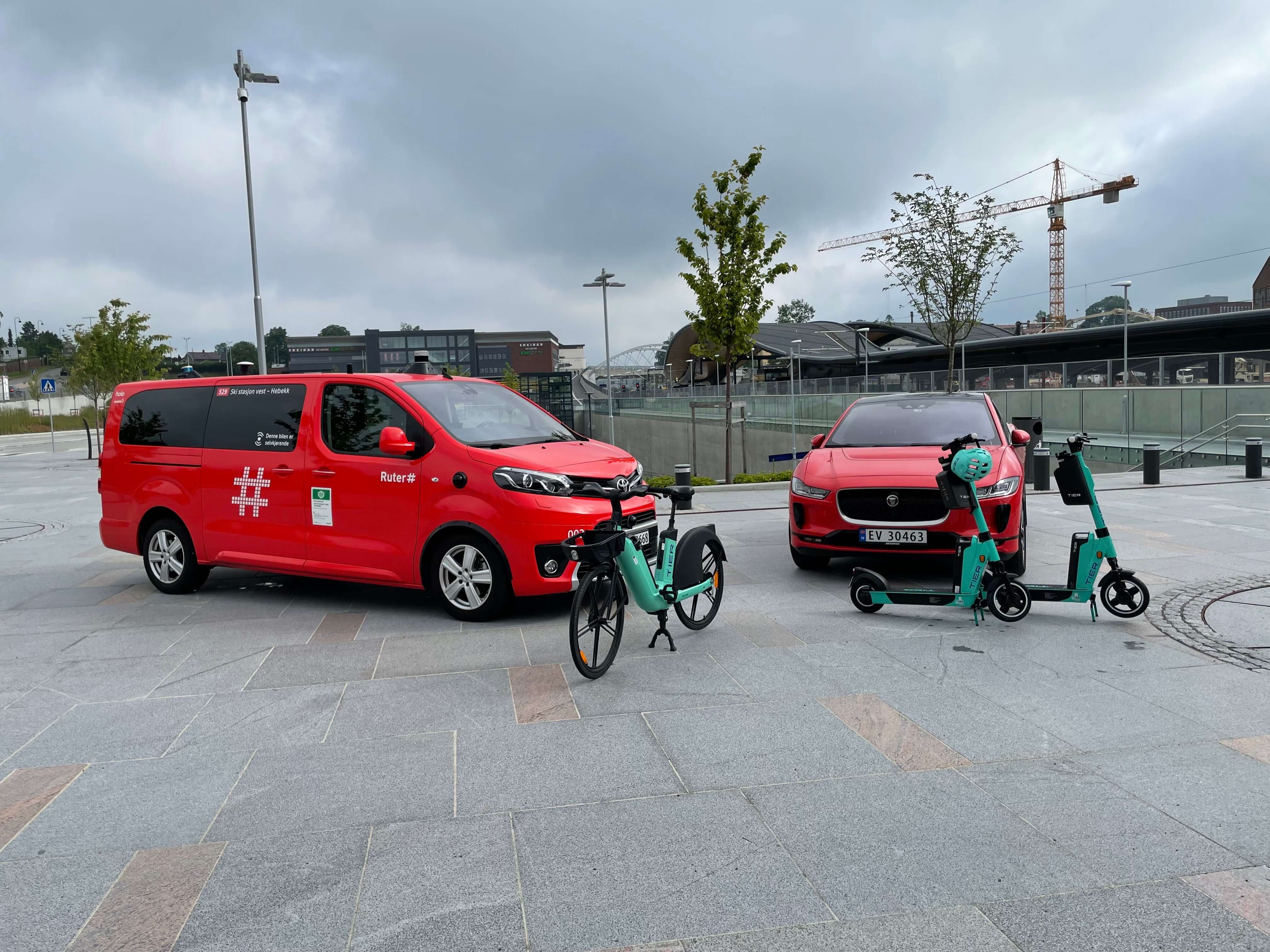
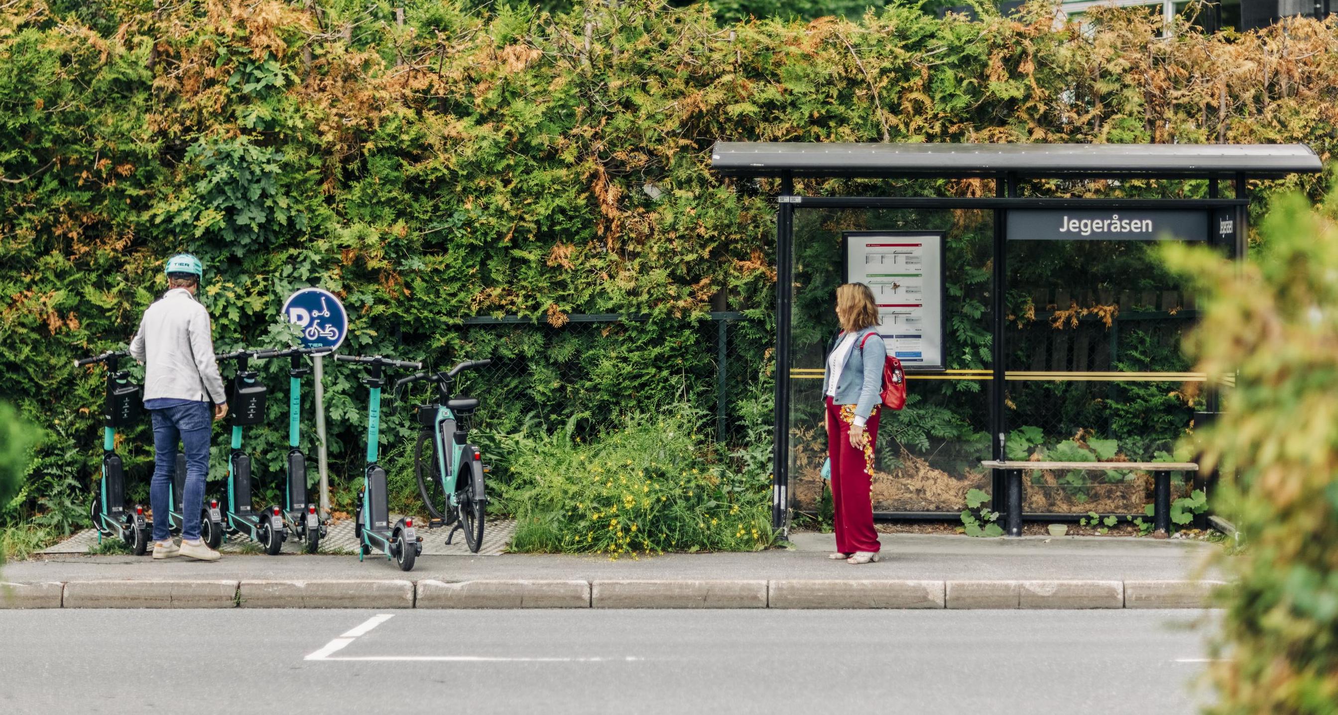
New mobility services
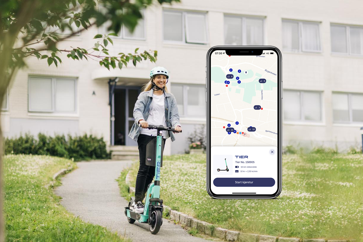
New mobility services in the app are an excellent example of how we work to realise Ruter’s goal of sustainable freedom of movement. The new app means that we will be able increasingly to offer active transport such as cycling and walking as alternatives when customers search for travel options. We will contribute further to our zero growth target, bicycle options and personal preferences in 2022.
Mobility services are also an example of Ruter’s approach to product development in the app. In order to establish a future-oriented and comprehensive micromobility offering, we have introduced the use of electric scooters as part of our services:
- Ruter has entered into a public sector partnership with Asker and Bærum Municipality.
- TIER GmbH has been chosen as a supplier and will be responsible for operating the service.
- The service needs to be seen as relevant and safe.
- The service is currently being tested on a limited number of users in the Ruter app.
This gives us valuable data about technical integration, user experience, customer service and the development of attractively priced products that are not only relevant to Ruter’s existing customers but also open to users with very different needs and travel preferences.
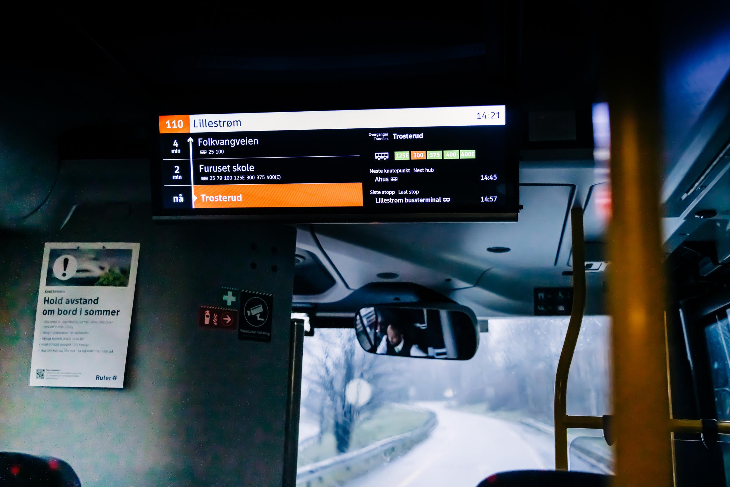
Customer information in other digital interfaces
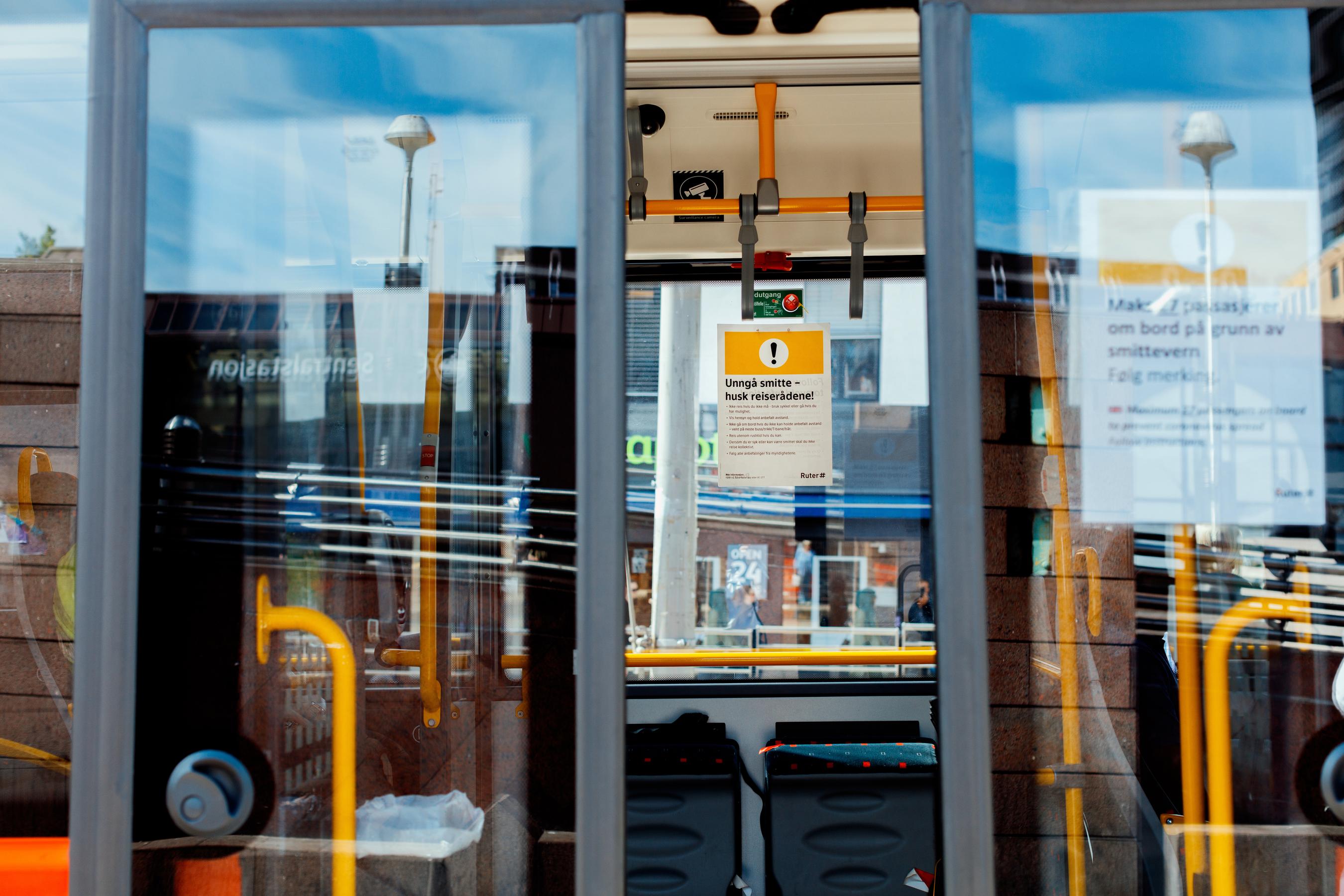
Ruter’s visual universe ranges from handheld gadgets to enormous vehicles. When the new app was launched in the summer of 2021, an entirely new brand profile was also introduced. For all interfaces to communicate with the same visual language, we introduced the same brand on digital stopwatch displays in the autumn. In 2022, we will continue with this work on screens in buses, on trams and on boats.
Ruter has its own team developing customer information solutions for digital screens – whether on vehicles or at stops. On-board screens display remaining time until the next stops while speakers announce the name of the next stop. Exterior speakers at each stop announce the line the vehicle is serving. Schedule deviation and other useful customer information is also available.
Digital screens
- Digital departure boards at stops: 156
- Digital departure boards on metro: 34 across 14 stations
- More than 850 buses (TaaS) with latest generation customer information screens
- Digital information screens on buses: approx. 2,500
- External screens/signage boxes on buses: approx. 2,500
Endless possibilities
Continuous development of customer information solutions in partnership with operators is being facilitated. These vehicles provide real-time data on where the bus is located, how many metres the wheels have travelled when the doors are opened, whether wipers are running and how many passengers are on board.
This information is analysed and forwarded to our solutions which in turn send this information back to vehicle screens in a few seconds – converted into updated customer information. This is also information we currently use in the app and will explore further as we develop the personal customer experience.
Close to the customer – the value of effective insight
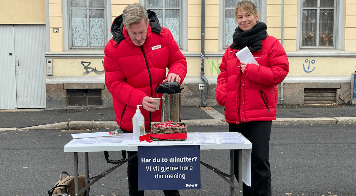
Red Ruter jackets. Coffee. A friendly smile and a hopeful look. You may have seen us out and about at stops in Oslo, with our prototypes and questions for commuters and travellers. These are so-called guerrilla tests. Getting out into the field means that we get close to actual scenarios and the practical needs of customers – a quick and easy way to get feedback on the issues we are working on.
In order to develop effective solutions, we have to gain insight into how solutions work in practice. That is why we test continuously during the design and development phase of our digital interfaces. Before the app was launched, it was used by about 500 testers over an extended period of time. These people now form part of a permanent test panel and can be called in for interviews or user tests at short notice. These are just some of the qualitative methods we use to observe how Ruter customers understand and utilise what we have created.
“Quantitative data can say something about how things are, but qualitative data can say something about why they are like that. Should we discover something surprising in the usage data, we dive in deeper qualitatively – and vice versa. It is at this intersection between methods that we have to ensure that user interests are taken into account as we develop the app further.”
The numbers speak for themselves
Ever since work on the new app started, data-driven decision-making has been a priority. By allowing quantitative usage data to form the basis of design and technical development decisions, we ensure that the needs of users are addressed. We have therefore provided the app with a number of data points that will give us the insight we need to enhance the user experience in the coming years.
Data are becoming an increasingly integral part of everyday life for anyone working on the development of the app. It is important that the data we use are relevant and accurate, but it is at least as important that they are made available to everyone. When data are included as a natural part of day-to-day discussions among developers, it becomes easier to define interdisciplinary priorities based on real customer needs.
When we launched the new app, we found potential for improvement in the conversion rate for customers who wanted to buy a ticket. On the basis of in-depth research, we redesigned the purchasing flow and rapidly saw the positive effect of our work.
When we launched the new app, we found improvement potential in the conversion rate for customers wanting to purchase a ticket. After thorough analysis, we redesigned the purchase flow and quickly saw the positive impact of this redesign.
graph